Sunday, 12 October 2014

Autumnal Colour...

This project is for the Craft Stamper Challenge
The challenge this month is to create something using multi coloured stamping.
I wanted to stick to just three colours of ink and to steer away from bright colours on this one, the colours I chose dictated the design. I wanted it to be relevant to the time of year - my favourite season is autumn. I love the colours and I was born in October so that may have a bearing on why I like this season!
I didn’t have an exact design in mind so just sort of went where it took me. I think I’ve ended up with a sort of journal page sort of thing (?!) - mind you, even when I do plan out a design - it never ends up the way it was planned in my head!
So my ‘ingredients’ were:
Tim Holtz Distress Stains, Peeled Paint, Mustard Seed, Vintage Photo for the multi coloured stamping. The stain gives a rather messy image rather than a precise one but I thought that worked well with the colours, sort of messy pile of leaves effect.
Archival Ink in Russet for all the edges, added with a dry baby wipe
Sheena Douglas Christmas Trees set of stamps, I used the branch, the tree and the fir cone
A diamond pattern background stamp (a stamp I use all the time)
An A4 sheet of patterned paper, it has a Christmasy flower pattern on it
Crown emulsion in Soft Cream and Hobbycraft acrylic in Parchment to tone down the pattern on the paper
A Letraset fine liner pen in black for the wording
And this is what I’ve created, it’s quite restrained and unembellished for me and more or less the only technique I’ve used is the multi colour stamping.

I do enjoy the Craft Stamper challenges, they are exactly that - a challenge! They help to get you out of your safe place and try new techniques and designs - always a good thing!

Wednesday, 24 September 2014

Turn Me Over Stamped Tissue Technique

This project is for the Craft Stamper magazine challenge…the link is just over to the left.
The challenge this month is for the technique of stamping onto tissue paper.
I have used tissue paper before when wanting to get a design onto canvas but usually by printing my image on it rather than stamping. I have a bit of a collection of different stamps so I should really stamp rather than print more often - I’ve purchased the magazine every month since I discovered it so I have all the free stamps to choose from!
I have made a couple of necklaces from Tim Holtz Grunge Board recently so decided to use the technique to create another one of these necklaces. I wanted to create a double sided pendant that was large enough to accommodate the stamps I had chosen without losing too much of the design. A pendant that could be just switched around to reveal a new design on the other side.
The only circle die I have is one of the XCut thin types and this would not cut through Grunge Board but I put it through my Big Shot a couple of times so it would leave a guide line for me to then cut the circle out with a craft knife - I wasn’t too bothered about it being perfectly round at this stage (I could not cut a straight line with a craft knife if my life depended on it, let alone a perfect circle)!
I painted it with white GeeSo Good Gesso then a layer of Docrafts Acrylic Paint in Tea Pink. I used a makeup sponge to dab some Docrafts Lavender Acrylic Paint through a Prima Marketing Raindrop Stencil to create little splodges on each side. I then used a fine liner pen in black to outline the little splodges.
The stamps I used are Stampers Anonymous (title unknown) and Stampede ‘Dreaming of You’ - I stamped the images onto Hobbycraft White Tissue Paper with Memento Tuxedo Black then I coloured with Letraset Promarkers (Wild Cranberry, Pink Lobster, Winter Berry, Rock Pool, Sandstone) on the reverse side of one of the images. I felt that the splodgey bits of lavender paint on one side of the pendant were enough colour for the other image.

Then it was just a case of a layer of Mod Podge Gloss Lustre on the pendant, tear around the tissue paper image to fit and lay it onto the pendant, add another coat of Mod Podge on top to seal and leave to dry. Repeat with the other side.
To add more texture and interest, I used a Star stamp that came free with an issue of Craft Stamper and stamped randomly with a Versamark Watermark Stamp Pad, then embossed with Debbie Moore Metal Magic Antique Gold Embossing Powder. I also used this powder on the metal birds.
I mixed some of the Antique Gold with some Heat It Up Black Embossing Powder and used this for the Recollections Bird Cage and also the rim of the pendant. This is why I wasn’t too bothered about cutting a perfect circle - I knew I was going to edge the pendant with embossing powder. I added a small Prima Marketing Brad from the Engraver range to the top of the cage - with its ‘legs’ snipped off first, then added one of the birds to the bottom of the cage. I added the two remaining birds to the other side. Docrafts Ultimate Craft Glue in Clear was my adhesive of choice on this project.

This is quite a large statement piece - it's four inches in diameter(!) so I kept the chain part fairly simple, just bronze coloured chain, findings and some small dark pink beads.

The technique of stamping onto tissue paper has almost endless possibilities in crafting - allowing you to add your favourite stamp designs to almost anything. As well as cards, canvas, boxes, mannequins, furniture, candles etc,  it’s perfect for this type of jewellery making.

I love that this is reversible - just turn the necklace round and you’re wearing a brand new design!

Watch this space for some matching earrings and a cuff bracelet lol x

Friday, 19 September 2014

Jar Of Hearts

The theme for the Hels Sheridan Sunday Stamper challenge this week is Music.
I don’t have any music related stamps so I have chosen to theme this around a verse from a favourite song…Jar of Hearts by Christina Perri.
I’ve used the lid from a chocolate box (Thorntons Premium Collection…which were very de-lish, thank you very much!) Black Gesso’d it, then painted it randomly with Docraft Artiste Acrylic Paint in Perewinkle, Sage, Seaspray and Antique Gold Metallic. I used the same paints on a piece of patterned paper which I tore to fit the inside of the lid. I stamped a diamond pattern here and there on the background plus some little hearts in a line, embossed with Heat It Up Embossing Powder in Baby Blue and Seafoam White.
I stamped LOADS of hearts of all different sizes and designs with a Versamark Watermark Ink Pad, then heat embossed with the Baby Blue and Seafoam White. The hearts were then coloured with Letraset Promarker Alcohol Pens in Denim Blue, Duck Egg, Sandstone and Gold. They then had to be cut out – a job I personally loathe – NEED a Scan’n’ Cut!!
 I glued them to the paper randomly with PVA then brushed Mod Podge Gloss Lustre over the whole lot. It gives it a sheen and helps them to stay stuck down.
I used the Mod Podge to glue three hearts inside the ‘jar’ – I used an empty spice jar. This was a little bit tricky, I used cotton buds to wipe off the excess that got smeared on the inside of the jar.
I painted the lid of the jar with white Gesso, then the Sage and Antique Gold paint. I attached stamped and embossed wings to another heart and glued this to the jar lid. I layered some more hearts on the background paper with sticky pads to give some depth and added some lace along the top of the box lid, and just inside the bottom, the lace was coloured with the promarkers.
I then wrote out the verse from the song freehand but also added some stamped letters in there too to mix it up a bit. I cut the verse out into seperate lines and used sticky pads to fix into place.


I quite like the way this turned out but it’s not my best work lol. I wanted to keep it quite basic and I think it’s the colours I chose that’s making me think it’s not all that plus the fact that there are no flowers or butterflies – that was hard! I’m not used to using these sort of colours so not only was a Sunday Stamper challenge, it was also a challenge for myself - not to use any purple, flowers or butterflies!

Wednesday, 23 July 2014

Where Do You Go My Lovely...

The ‘My Lovely’ in question is in fact my Mojo!
Since making the quickie necklace (see previous post) that creative thing that I hear many people calling their Mojo has up and done one.
Well actually if I am honest, I could just be blaming him or her even for my complete lack of enthusiasm and can’t be bothered attitude, both of which are firmly ensconced.
I have plenty I could be doing, my step father’s birthday card for one, which is in a few days. I have lots of projects all written and sketched out in my various ideas books, I have absolutely loads and loads of ideas running around in my head. So I can’t really say it’s the creative thought process that is eluding me – I’m just being out and out lazy!
But what can you do when you get like that – I keeping saying to myself, come on mrs, have a word with yourself, get your backside into gear – but I’m just not listening.
So this afternoon, quite late on I took myself upstairs, got sat down at my work space and said out loud “come on, just do it”!
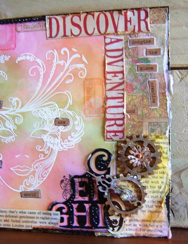
This is the result – there is no rhyme or reason, doesn’t really make any sense (but then again, does it have to?) but at least I have emerged from that craft room triumphant – I have made something!

The ‘face’ was already sat there, I had used two different stamps and white embossing powder to create a resist image for when I added the distress inks, but had not got any further than that. Which is a shame because I had intended to enter whatever I ended up making into the last Craft Stamper challenge. That didn’t happen because it was abandoned when the lazy vibe took over and I realised I would not get it finished in time.
I started with the face this afternoon and literally just started adding torn papers, words, ink, embellishments and more stamping. I didn’t really think about it, wasn’t that precise about where things were placed and wasn’t that bothered if it ended up looking messy (you can see the glue in some places)


 I was just determined not to come out of that room without having been productive and a little bit creative.

I am going away in a couple of weeks so maybe that will reinvigorate me and when I get back I’ll be like a maniac and it’ll be non-stop creating… 

Wednesday, 16 July 2014

A Bit Of Grunge (Board)...

This quickie blog is about a necklace I made recently.
A very nice lady that I talk to on this here social media thingy, asked if I would share how I made it. I have such lovely, funny conversations with her that I’m only too happy to share - I won't name her, she may not want the publicity lol ;-)
I needed a necklace for a birthday do I was going to that evening and unbelievably, I had nothing that was the right length for the top I was wearing.
So out came the Big Shot and an hour or so later, I had me a necklace!
The first photograph shows the ‘ingredients’ that I used. These are the items that I have in my ‘stash’ you could of course use anything that you have in yours. That’s the beauty of crafting handmade pieces, it’s all open to your own interpretation.
Firstly, I got the O.H to punch a hole in the centre of the two shapes and a hole in the top of one of the petals of the base shape. I’m rubbish at that bit, I don’t seem to have the strength in my hands to work the very naff hole puncher that I have.
A Crop A Dile is on my ‘Must Have’ list – which grows longer by the day!!
I used the Tim Holtz Alterations Tattered Florals Die to cut Tim Holtz Idea-ology Basic Plain Grunge Board into the flower shapes, I only used two of the shapes for this necklace. You could use as many layers as you want.
I painted them with white gesso (forgot to include the pot of gesso in the photo, sorry) I used Indigoblu GeeSo Good White Gesso but any other brand will do the same job really.
I swiped Tim Holtz Weathered Wood Distress Stain over the shapes, I put about three coats of stain on, drying between the layers so I could get some intensity of colour in random spots. I dabbed Wild Honey Distress Stain lightly on the edges of the petals. (I also used a light spray of Cosmic Shimmer Mica Spray in raspberry) I stamped a bit of pattern with Black Soot Distress Ink using a Rubber Stampede wooden stamp called Declaration of Intention on the base flower to add a bit of interest. I stamped it randomly, I wasn’t bothered about lining it up or anything – I just wanted a bit of pattern rather than the actual picture.
I pressed the top flower layer into a Versamark Watermark Stamp Pad (which I’ve also not included in the photo - useless!) covered it with Stamps Away Ultra Thick Embossing Enamel (Utee) heat set it and then repeated with a second layer. I then repeated again for a third layer but before I heat set it, I inked up the swirly part of the Inkadinkado wooden Happy Birthday stamp with Dew Drop Brilliance Galaxy Gold Ink. You need to get this bit ready to go as soon as you melt the third layer so you can move quickly and stamp into the melted enamel before it starts to set. This will give you an embossed pattern from the stamp. Press the stamp into the molton enamel for about 20 seconds, lift off carefully and you should have a nice impression from the stamp with whichever colour ink you have used.
The enamel works as a kind of seal on the grunge board, a kind of protective layer, stiffening it at the same time. I didn’t bother using the Utee on the base flower as most of it isn’t on show anyway.
Join the two layers together with a brad of some sort, I chose a pearl type one in a co-ordinating colour. I’ve got some lovely vintage themed ones with clock dials, keys, script etc on them so I’m going to use those on the next couple of necklaces that I make. I fully intend to make some more of these – I can see them becoming quite addictive!
I finished the pendant off with a simple bronze coloured chain and teal green bead.
I felt that this was all it needed but you could use leather or suede thong, some lovely ribbon or a beaded chain, depending on what style you are after. You don’t have to stick with a floral them either, lots of other shapes would work too. How about a lovely tweety bird or a birdcage, a birdhouse, a heart, an owl, a fox ? – you can get dies in any of these shapes or you could even try to cut your chosen shape by hand – good luck with that lol !
I was inspired by a tutorial by Ellen Schrik in the August issue of Craft Stamper magazine. I had been flicking through the magazine that morning and had read a tutorial on making a pendant using Utee. So when I began looking through my necklaces for that evening and couldn’t find one that I was happy with, I remembered the tutorial and thought haha! - that technique will be perfect for a bit of grunge board. The pendant in the tutorial was made out of card but the finished result with the g.b works just as well and I think may be a little bit sturdier (?)

So that’s how I did it – nice and simple and I hope it inspires you to create your own unique piece!

Tuesday, 17 June 2014

Oh The Pressure...

Today I’m sharing a recent order that I managed to design and complete in 5 days.
The customer had mentioned at least two months previously that she would like me to design and create a wedding card. I gave her my contact details but then didn’t hear from her so presumed she had changed her mind.
When I did catch up with her and asked her about it, she said she had totally forgotten to send me the details of what she wanted but could I still do it – for the following week!
“Of course” I said,  “no problem” I said!
Now ordinarily that time scale would not be a problem for a ‘normal’ wedding card but this was no normal wedding card - the remit:  “Alice in Wonderland, red, white and blue, make my card stand out above all the others and make it big” !
“Er…ok, any other instructions”?
“No, just go for it, oh and the bride has got blue hair and the groom’s hair is silver”
Well they sound like my kinda people!
So the photos you see here are the result of that conversation and I did manage to complete this in 5 days so the customer could collect it in plenty of time before the wedding. 
(the last pic is the box lid)


The customer is the bride’s mother so the pressure was really on, not just to finish it in time but to get it right. She absolutely loved it - I’m not sure what I would have done if she hadn’t!
I’m not sure that I would want to do this again though. I’m happy to take on last minute orders for cards or anything else. I have done many times but they’ve been orders for quite basic A5 size cards. This one really did put me under the spotlight (and it was very hot under there)  it didn’t go completely smoothly and there were a couple of false starts and do overs. This has taught me I don’t function well under the whip!
I’ve yet to catch up with the customer to find out if the bride and groom did indeed like the card and if it filled the brief so I’ll have to report back on that at a later date.

(this was a completely unique card just for them so in respect to that there’s no tutorial)

Thursday, 22 May 2014

From This To This......

I don’t think I’ll ever stop being amazed at how you can turn a white piece of card or a blank surface into something completely different, just by using paint and ink and a few embellishments.
This piece started off as a blank wooden frame around a small mirror – one of two that I purchased at a local car boot sale…never underestimate just how useful these places can be for crafters and artists!
I was inspired by two things when starting this project – Kay from IndigoBlu and the free Bird Stamp that came with the June issue of Craft Stamper magazine. Kay did a mirror with a seaside theme on the Create & Craft TV programme, it was really lovely so I was inspired to pull one of the mirrors from the ‘to do’ pile and make my version of it. The Bird Stamp made me think of a garden floral type theme so that’s where I headed.
Now, as is usual for me, I forgot to take photographs as I went along. I started out well with the first three pics.....


then got so in-grossed each time I worked on it that the photo thing went out of the window - that reminder note I’ve pinned above where I sit is sooo not working!
So with this one you’ve got more of a written explanation rather than a visual one.
I gave the frame a coat of Black Gesso then some Acrylics in different blues,  then I painted a 12x12 piece of Patterned Paper with Acrylic then cut it to size and cut the aperture from the middle to fit the mirror. I roughened and distressed the edges with a Scissor Blade. I used Texture Paste through a Branch Stencil then painted over it in toning colours and added some pink and gold for the ‘blossom’. I then randomly stamped Flowers, Birds, Foliage and Dragonflies in Black Ink without really taking too much care where I stamped. I also stamped circles using a Plastic Spray Bottle Top and gold grid lines using a Plastic Loyalty Card. I randomly added Metal Effect Embossing Powder and there’s a bit of pink Gilding Wax in some areas too.
The Butterflies were stamped onto Tissue Paper then coloured with a Promarker, then ModPodged onto the frame, then a bit of doodling with a White Gel Pen. The bird was stamped onto White Card, coloured with Distress Ink and given a layer of Glossy Accents. The Bird Cage is a Recollections Die Cut, which I painted and embossed and gilded, adding a little Brad to the top.
I painted the paper flowers with White Gesso and then Luminarte H2os, using them to embellish around the aperture along with a bit of Lace and some turquoise Gems thrown in for good measure! 
I wanted this to be quite restrained and distressed so I tried really hard not to be neat and tidy and not to over embellish. When it was nearly finished I wasn’t really that happy with it – I felt it was too dull, that it didn’t ‘pop’ enough. I think that’s down to the colour palette I’ve used so I just continued with it to see how it ended up rather than adding it to the abandoned pile – I’m sharing because I’m really quite pleased with the way it turned out.


Onwards now to the next little project…a handmade colouring book birthday gift for a little girl who’s got a thing for colouring and drawing and who just loves pencils and paper…she sounds perfectly normal to me! 

Monday, 21 April 2014

Powered By The Light

My entry into the Craft Stamper Challenge... the link to Craft Stamper is just over on the left.
I have only entered two challenges before, both for the talented Hels Sheridan’s Sunday Stamper. Those challenges are based on a name being randomly drawn, not on the design you have entered but the Craft Stamper challenge is all about the design. This will be the first time I have entered a challenge like this and it was really hard not to ‘over think’ the whole project! I don’t expect to win and I am entering as more of a challenge to myself really. I’ve done it to see if I could finish a piece of work to an absolute deadline without totally obsessing about it and giving up half way through because in my head it just wasn’t going to be good enough - so I just went for it.
The remit was altered bottles/vials and of course stamping.
So this project evolved from the thought “I am powered by the light” – as we all are. We cannot live without it, be it natural or artificial.
I started with a white canvas which I turned over so it became a frame and painted the inside edge with a mix of blue, green and yellow acrylic paint.
I then created some light bulb patterned paper digitally and lined the inside of the canvas and the frame edges.
I used some bubble wrap to stamp patterns over the light bulb paper and then used the free bottle stamp from the May issue of Craft Stamper to stamp around the edge and the inside. I also stamped this image several times on card, embossed with white and crystal embossing powders and cut them out.
I mixed some acrylic paint with texture paste and spread this into two of the corners – I don’t have a spatula, spready thing so I use an old plastic membership card, it does the job just as well! Lace was added top and bottom then I added gilding wax to the ridges of the texture paste. 
I resized and printed out an image of a light bulb and stamped a decorative face onto it and embossed this with black embossing powder. (I found this stamp in a charity shop so I don’t know where it is from) I white gessoed the background and edges to tone it down a bit.
I printed the light bulb pattern onto tissue paper and applied this to the inside of two of the little box lids and also to the outside of three of the vials. I stamped the bottles onto tissue paper and applied these to the inside of the two more of the box lids. I fixed the tiny vial into the round box lid with some patterned tissue behind it.
 I stamped the pattern around the edge of the light bulb and randomly over the canvas using the hair part of the face stamp. 
I then arranged the box lids on top of the face and embellished the canvas with paper flowers, leather leaves, brads, hinges, bead filled bottle caps, split rings, corners and gems. I also used gilding wax on all the edges of the canvas and on the embellishments and the stamped bottle cutouts.
If you look closely, the vial with the lace around it contains a teenie tiny light bulb!
Finally finishing off with the wording “I am powered by the light”
By the way, this is also the first time I have actually written down how I have created a project so my apologies if I have not explained this very well!
  

Saturday, 12 April 2014

Forgetfulness - A sign of genious?

Forgetful – adjective: apt to forget, absent minded – in other words…the mind is absent!
At least I feel like mine is. I cannot seem to retain things in my brain that I am supposed to remember. Especially things that I am supposed to actually do.
Walking into another room in the house to do something or get something and promptly forgetting it as soon as I’ve walked through the door is a regular occurrence. I end up just standing in the doorway for ages, trying to prompt myself to remember what it was. Inevitably, it doesn't come to me, I have a swear, then leave the room. 
Is it age? I am on the wrong side of middle age after all so maybe that’s it. Or is just part of our genetics, because I know I’m not the only one who has this problem and not all of these people I know are ‘mature’.
This lack of ability to remember things has resulted in my becoming an endless list maker. I have not gotten to the stage of making lists to remember I’ve made a list but I don’t think that’s far off.  Piles of paper scraps litter the house. Lists for shopping, lists for house chores, lists with meal plans for the week, lists of projects and orders to do and to finish, lists of where I am supposed to be that week - the list is endless...(sorry couldn’t resist that one)
Tired of having to gather up all these bits of paper every so often to get them in the recycling, I tried to compile my lists on the computer, all typed in with headings and columns and everything – that didn’t work – I forgot to look at them!
The latest canvas project I’ve just finished has reminded me of how bad I am. I really did mean to take photographs of this work as it progressed from start to finish but before I had even finished that first coat of paint, I had forgotten what I had reminded myself to do. There’s no hope for me is there?
I have now resorted to sticking a piece of paper on the shelf edge above where I work, which says… “Rememeber to take the photos you forgetful old bat”

I just need to remember to look at it!

Monday, 7 April 2014

Vintage Nirvana

Newark Auto Jumble  -  the title leads you to believe that it’s a jumble sale of vehicle related stuff and indeed it is – but it is also the home of all manner of treasures and finds that belong to yesteryear.
Amongst all the exhausts, engines, nuts, bolts, and tyres there are quite a few hidden gems if you look close enough.
As you can see from my pics, you can find anything here from old computers to cash registers as well as the odd eccentric!

You usually have to elbow some flat capped old boy out the way first mind, they like to hover and lean over the stalls poking everything with their walking sticks whilst muttering “aye lad, I had mesen one a those when I were a lad, tha knows”
Now, an auto jumble is not usually up there on my want to do list on a Sunday but the o.h asked me to go with him – and yes, I know the reason why – a second pair of hands comes in very handy to carry your spoils whilst you’re busy perusing what other stuff you can’t possible live without.
Anyway, I didn’t mind too much, there was plenty for me to look at by way of all the lovely cars that were lined up.

I love old cars, so much individuality and character. They put our modern day boxes on wheels to shame. When I was about 4 or 5 years old, we had a Hillman Imp, I don’t know how a family of 4 managed to squeeze into that little toy car! Then later, when I was about 7 or 8, my father bought a Rover 3.5, oh we thought we were sooo the bees knees riding about in that!


Me and the o.h would love to own a classic car but with the mileage he has to do for work, alas, it is not practical.


We may have to wait until he retires but we will own one eventually – we’ve just got to choose which one. There’s so many I love, we may just have to pick a name out of the hat!

Friday, 28 March 2014

There Are Other Colours

I did take on board the o.h’s comment “there are other colours out there” and have just finished a project without a hint of purple.
I purchased a ‘blank’ jewellery tree from Hobbycraft a couple of months ago in their sale - Hobbycraft always have a really good sale in January, especially on their paper-mache items, it’s a good time to stock up on these if you use them a lot.
I had intended to go all gothic on it but that would of course meant that I would revert to type and it would end up purple and black. So I put all the purple mediums in a box, locked it and threw away the key  - well I put it in a safe place…you know, that place every house has and when you go to get the item, you can’t remember where you put it!
Because the jewellery tree looks like a tree (!) I did the obvious and went for a woodland theme with the fairy stood against the trunk, surrounded by flowers and butterflies. I’m quite happy with the way the colours look, I based these around the colour of her dress and I think it works.
I don’t have a problem using other colours on my cards, it just seems that whenever I start a canvas or some other decorative item, I just automatically reach for the purple. I enjoyed the challenge of using different colours on this project and it inspired me to keep away from the purple when designing the cards I’ve just completed. I managed to make four without using purple!


P.S - a few days after the o.h made the ‘other colours’ comment, I up and went and had the front of my hair dyed purple!!  

Wednesday, 19 March 2014

All Purpled Out...?

I love fantasy imagery, just love it!
I have a folder on the computer in which I store any pictures that I find of fairies, elves, toadstools, anything dark and gothic, gorgoyles, gremlins, witches, wizards, anything that conjures up a fantasy, other worldly image, including anything that has a steampunk vibe.
Of course if the images also involve my favourite colours - purple (of course) and black - then so much the better!
A lot of my designs do have this vibe about them in some way or another, if you have a preference for something, it’s hard not to include it when working on a project.
I do have to restrain myself on commissions though and follow the customers brief, not my own!
I’ve had this decoupage fairy in my crafty stash for ages, sitting unloved in a box. So I fished her out a couple of weeks ago (it could have been longer knowing the rate at which I work) and sat looking at her for a bit, waiting for inspiration to get it’s backside into gear. It came to me that she would be perfect for an altered frame so I set about designing and creating the frame around her.
I love how it turned out, even if I do say so myself.
I was creating this frame round about the same time as I was finishing the ‘Purple’ canvas (see previous blog post) and it was pointed out to me “do you not think you’re going a bit overboard on the purple, do you think you ought to do some projects in different colours” I’m sure you can imagine the look that the o.h got in reaction to this comment!
But I can see  - grudgingly - that he does have a point.


So we’ll see if I can reign the purple vibe in a bit and try to embrace some of the colours that are out there ?!


Sunday, 16 March 2014

The Colour Purple (pt 2)...

Following on from my last blog ‘The Colour Purple’ and the fantastic poem by Jenny Joseph

I was recently in town doing some errands and I spotted this lovely lady in the queue ahead of me.
When I saw her, I was immediately reminded of the poem. This lady, although not head to foot in purple, so embodies the message of it.
I watched where she headed for when she left the store and caught up with her. She very graciously let me take her photograph and we had a lovely conversation. I told her that I was going to put her picture on my blog, she gave me her ‘business card’ so that I could name check her! She told me that she has a computer so she can skype with her son, who lives less than 20 miles away from her -  that did amuse me.
I didn’t ask her age but I’m guessing, she was well into her 80’s and she obviously didn’t give a flying fig about what other people might be thinking when they saw her.


So thank you Margaret, for making my day - I take my (purple) hat off to you!


This canvas is something I created recently with the poem as the subject…